Build a marketing engine that works for you.
Strategy, websites, and local visibility that turn your online presence into a predictable source of customers. Because your marketing should work while you are:
You’re Great at What You Do. That’s Not the Problem.
You know your business inside and out. You’ve built a solid business. Your customers are happy. Your work is quality.
But you're stuck:
- Most of your leads still come from word-of-mouth, so when referrals slow down… everything slows down
- Your business looks great in person, but online you’re nearly invisible when people search for what you do
- Your marketing feels random — a website here, some posts there — but nothing working together to generate consistent opportunities
- You want to grow and hire, but you don’t have a reliable system bringing in qualified calls every week
You didn’t start this business to stay stuck chasing the next job. You started it to build a company that runs on systems — including a marketing engine that consistently brings in the right opportunities.
We Work With People Who Make the World Work
- The people who get their hands dirty
- Who show up when things break
- Who build things that last
- Who make the world a better place
- A healthier place
- A more beautiful place
Most marketing people don’t get you. They want to sell you social media strategies and branding exercises when what you really need is simple:
- • Strategy on what to say, who to say it to, and where to say it
- • A website that actually brings in the right opportunities
- • Show up when people are looking for what you do
That’s what we do. And we do it because we believe the people who make the world work deserve to own businesses that work for them.
Three Moves That Change Everything
A proven system that positions you as the obvious choice in your market.
Most businesses don’t have a marketing problem. They have a positioning problem.
We figure out:
- • What to say
- • Who to say it to
- • How to say it so people actually take action
Not generic messaging. Not guesswork.
We study your market, your competitors, and your best customers — then build a strategy that makes you the obvious choice.
Most companies skip this step. That’s why their marketing never works.
Not a brochure. Not a portfolio. A website that drives your business forward.
In today’s world, your website is your source of truth.
Search engines read it. AI systems reference it. Customers judge you by it.
If it’s unclear, outdated, or weak — everything else suffers.
We build a site that is clear, trustworthy, and designed to generate real opportunities.
Every page has one purpose: Move the right visitor toward action.
Because when Google, AI, and your customers are all evaluating you at once, your website has to hold up.
We don’t chase traffic. We position you where high-intent customers are already searching.
When someone nearby is actively looking for the best at what you do — you show up.
Not just on Google:
- • Google Business Profile
- • Local search results
- • Your website
- • Social signals
- • AI search engines
Your entire digital presence works together.
Closer proximity. Higher intent. Better customers. Top-dollar jobs.
Because visibility only matters if it attracts the right buyer.
Most businesses try to “do marketing.” We build a system that makes you the answer.
You're Great at What You Do. Marketing Shouldn't Be What Slows You Down.
You deserve a clear system that works as hard as you do — so you can focus on the work that matters.
You didn’t start your business to become a full-time marketer.
You started it because you’re skilled. Because you care about quality. Because you wanted to build something of your own.
Now you’re juggling:
- Jobs
- Hiring
- Cash flow
- Customer expectations
- And trying to “post more” or “fix your website” at night
That’s exhausting. And it’s not sustainable.
You don’t need another tactic. You need a system.


- Clarify your positioning and offer so people know why to choose you
- Build a website that becomes your source of truth
- Show up where high-intent buyers are actively searching
- Turn scattered marketing into a structured growth engine
This isn't theory. It's practical, strategic, and built for real businesses.
Don't Just Take Our Word for It
Real feedback from real clients who trusted us with their business growth.
"Brad McMahan has built out for me what I would refer to as a "1000 Horse Power Sales Engine." From the written word and website headlines, to my email campaign, lead capture, and all of the moving pieces, Brad has simply simplified my life tremendously. If you own a business or work in any type of sales position, Brad can help transform your business in just a matter of weeks."
"Working with Kudzu was a great decision. They laid out a plan to help my website become a top search result, and executed it flawlessly. My business began to see more visitors to my website and more referrals direct from the site."
"The team at Kudzu Digital made me feel comfortable right away. Their professional and creative approach was evident from our first meeting. The final site is innovative and works perfectly on every device. I would highly recommend Kudzu Digital to anyone looking for a reliable web designer."
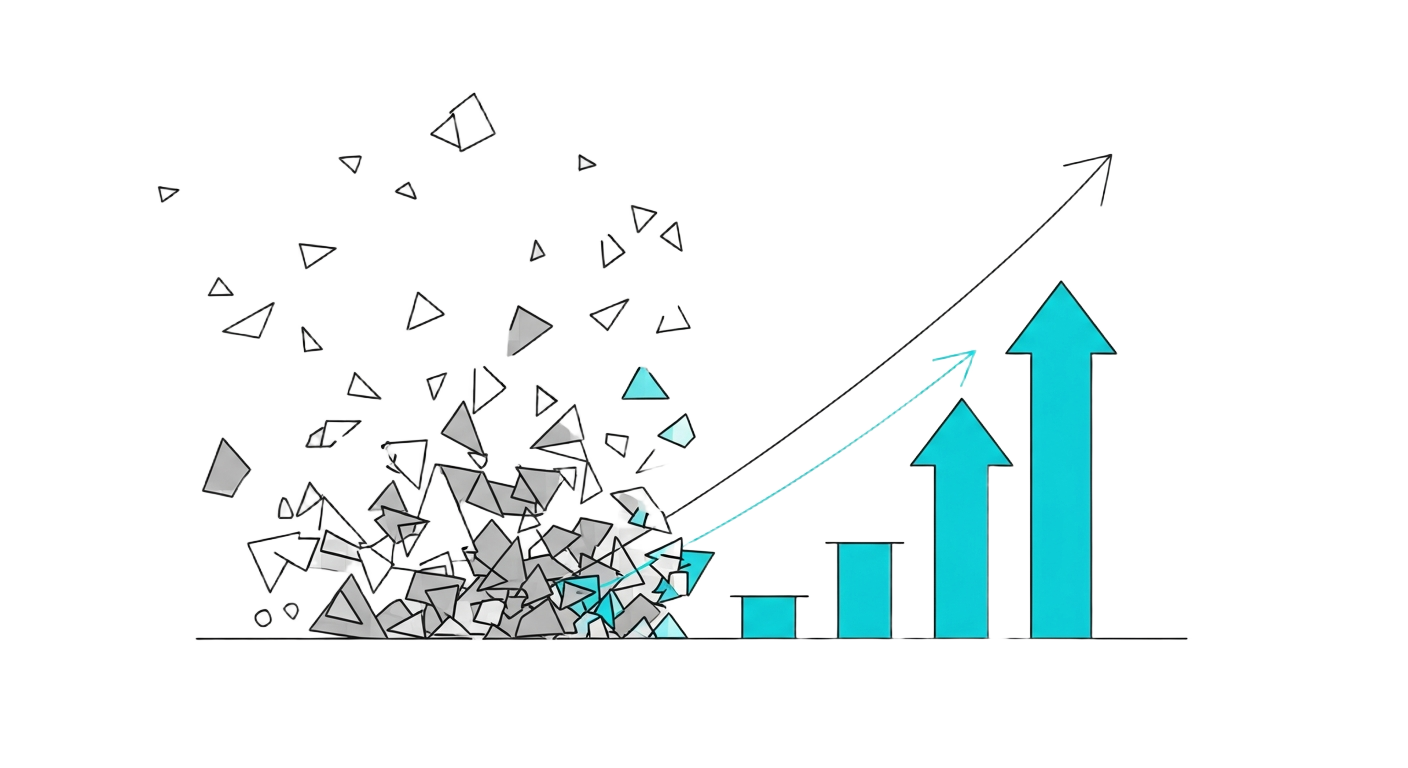
Real Results From Real Businesses
Here’s what happens when you lead with clarity and build a system around it.
Demand increased so quickly that pricing doubled within 3 weeks — not from design changes, but from messaging clarity alone.
Not a bag of tactics. We start with messaging clarity, then build the website and local visibility that turns that clarity into growth.
Ready to scale your business?
Let’s talk about where you are and where you want to be.
What Changes When You Get This Right
The phone rings with better jobs (not just more jobs)
You attract customers who value quality and pay on time
You can say no to the jobs that aren’t worth your time
You hire good people and actually have time to train them
You work ON your business instead of being stuck IN it